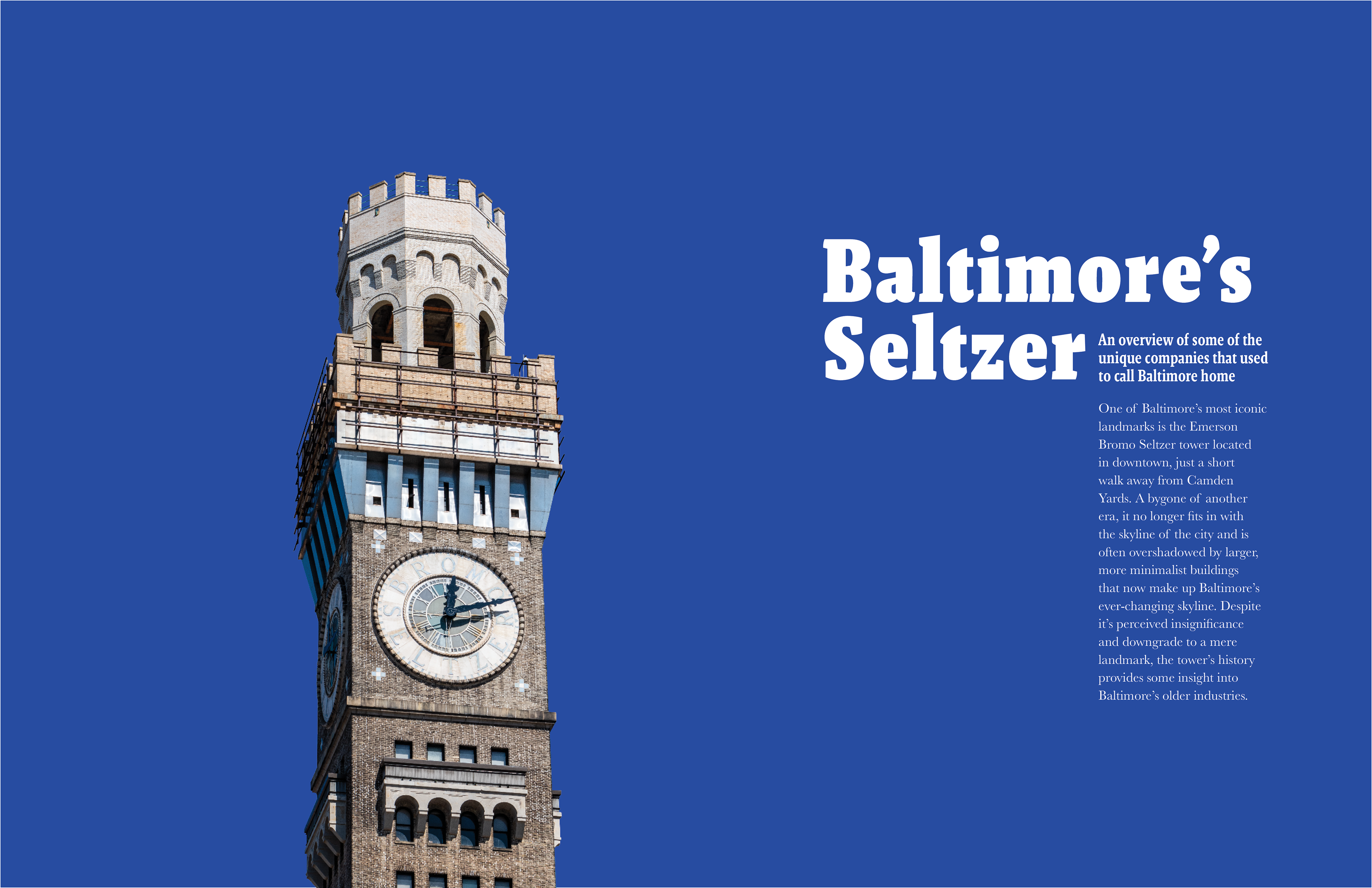

The aim of this magazine was to talk about the history of some of the historical industries that used to exist in Baltimore. The main article was focussed on the Bromo Seltzer company and the clock tower that was left over after the factory was demolished.
Throughout the articles I make use of the typefaces Malaga and Baskerville. By using Malaga I seek to invoke a much older feeling as it is a slab serif. Baskerville serves as a body type that is much easier on the eyes, and keeps with the theme of old industry.
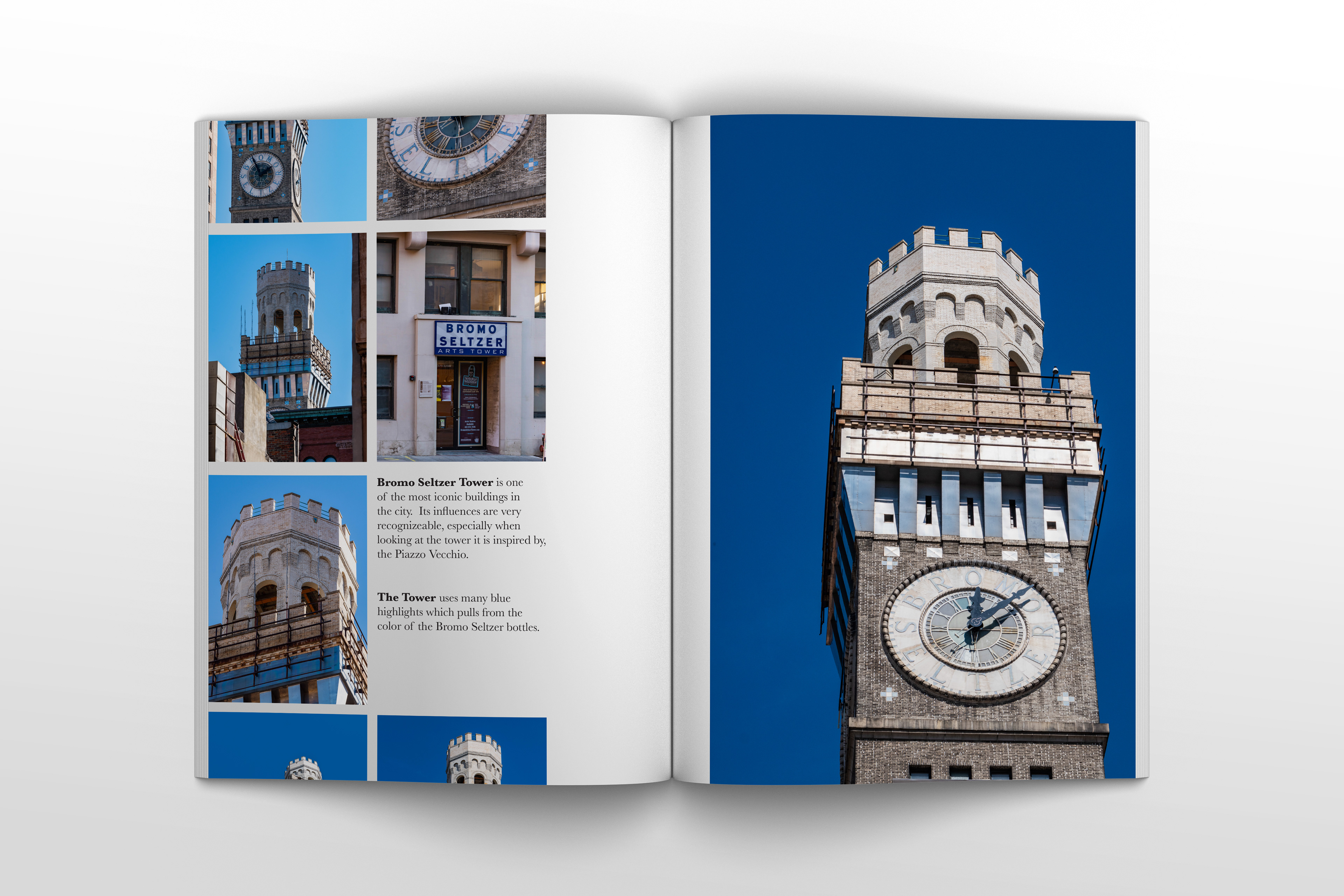
Much of the photography in the magazine is my own, and seeks to capture the fine detail on the tower. The photos lean towards minimalism as much of the scene around the tower is crowded by the skyscrapers that make up the Baltimore skyline.